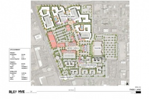
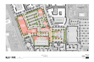
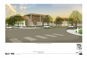
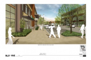
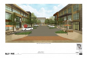
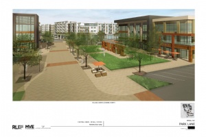
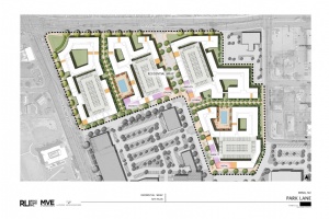
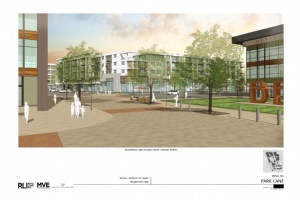
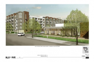
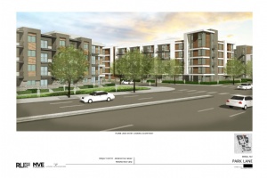
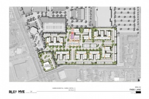
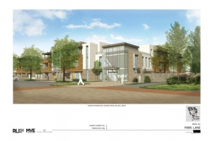
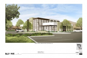
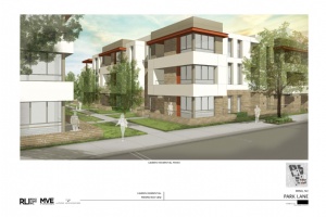
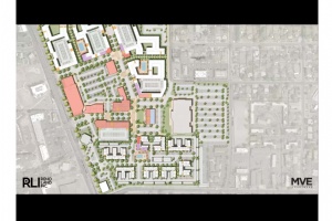
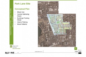
Check out high resolution renderings and details of the Park Lane Mall plans for the giant property on the corner of Virginia and Plumb.

High Resolution Renderings of Park Lane Mall Plans
Park Lane Mall Project Gallery |
-
This is a great looking project, but the apartment complex at the south end is far too suburban and definitely out of context. They should go back to the drawing board on that aspect.
-
The good thing is the parking is inside and not expose to Virginia street. There is still too much street parking around the retail area. The style is too modern. I though they said the style is modeled after Santana row in San Jose. This is nothing like Santana row.
-
Not a bad start. Don't like the wall of parking enclosures making phase 1 seem almost gated. from the surrounding community, but that is probably purposeful. Shopper's Square is talking about a $15M rehab, so don't dig the wrap-arounds on the corner instead of reinforcing the retail core on the corner.. Why Reno would donate $3.5M to make this happen is beyond me, but whatever.
-
The wraparound apartment area makes the Plumbest lane area look urban!
-
A smarter city would kick in a density bonus and cut parking requirements rather than paying direct infrastructure subsidy. Core redevelopment on our best transit line means there is no reason for this not to be 4 or 5 stories instead of 3, with residential parking an optional extra cost.
-
will somebody please demo that turd of a heritage bank?
-
It looks weak!! Nothing to do with the midtown connection it is suppose to be..more shopping structure and two three or four story shopping retail/restaurant choices need to be put up front..can someone please tell the old geezer developer this is NOT wat Reno wants... This is Center of town..it should have higher standards .. They should prob look at South Tahoe and all of their redevelopment plan they have with their NEW shops and retail/restaurant options they have which is pedestrian friendly to the Main road ..people can actually walk in and out of these places from the main road.....this team needs to go back to the drawing board..No wonder Vegas and other cities make fun of us..Reno just can't get it together
-
Needs a monorail and more large scale fountains. The monorail could go in a clear tube that goes underwater - under a fountain.
-
I'm really disappointed in this project, the design lacks excitement. I also think there is too much space between the retail areas and what I mean is you have to walk thru large expansive areas to get to some of the retail, reminds me a bit of Summit Mall in that regard which I think is a dude because it is not a walkable mall you have to navigate huge parking lots. Bring the retail in physically closer to the theater too, it needs to feel more like a "city within a city"
-
I really hope they get this thing right, because there aren't many opportunities to have a middle of town project of this size. To me, the concept seems OK. A decent mixed use project, but it does seem a little under ambitious. I wouldn't mind seeing something a little more vertical, at least in part. My biggest issue would be with the Architecture. Maybe it's just the renderings, but it looks kind of bleak.
-
It's better than what's there right now, but IMHO, they should have designed it to be more similar to complexes such as Santana Row in the South Bay. TBH, this just looks... Boring.
-
Where are the parking spots?
-
The layout may work but I find the styling is weak, very cold and austeer. I know there on budget but I was hoping this project would add some charm to our community. This is far from being charming.


I've been waiting to post my C.A.V.E. thoughts anonymously! It's a little bland, and Californian... That said. I'm for walkable and redevelopment. Hopefully it comes to fruition.