Center Pine Construction Update

by Mike Van Houten / Feb 13, 2017

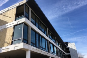
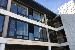
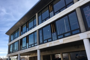
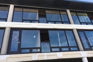
Check out photos below of the transformatin of 200 South Center Street into Center + Pine, a collection of 24 high end lofts. 

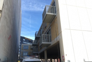
A wall of glass is forming along Center Street, and in the photos below you can see the doors in place for what I'm guessing are future balconies, or maybe they'll be similar to 8 On Center and just open to allow a breeze in, or open up to a deck built out over the new first-floor extension? I noticed only the lower level of residences have the doors.  

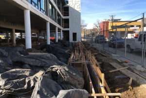
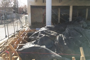
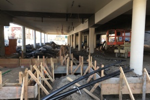
On the ground floor you can see the foundation being formed for the extension of the first floor to allow for a restaurant/retail space. 

Center Pine 2-13-17

Post your comments
  • February 13, 2017 - 7:12:31 PM

    But what about the PaRkInG!?!?!?

  • February 13, 2017 - 9:21:20 PM

    spectacular view from the rear balconies!

  • February 13, 2017 - 9:35:12 PM

    H.E., there will be a parking garage on the first floor behind the retail/restaurant space. To Ken M, when I lived in NYC I had a view of a building 15 feet across an alleyway which cost $3500 a month. Your point is? Not everything can have a view. And that's ok.

  • February 14, 2017 - 8:18:04 AM

    somebody is a staunch supporter of bad design and high rent.

  • February 14, 2017 - 8:37:07 AM

    Ah Ken M, so you would rather have a crumbling weekly motel there that didnt even meet code standards, had no kitchens or even hot plates for renters, and invited living standards that no one should have to endure, over a rehabbed building? Im a fan of a balance between high and affordable rents. Not every residence downtown needs to be cheap, or expensive. Rents for the building havent been announced yet, unless you know something I dont. As far as bad design goes, thats a matter of your opinion. Every single comment on my site from you is negative. Why do you bother reading my site if you cant seem to ever find anything positive to talk about? Does anything actually make you happy? lol

  • February 14, 2017 - 9:57:16 AM

    Thanks for your support, Mike! I'll take credit for the "bad design", Ken. Sorry you think so. We're just trying to preserve some of our City's identity while making it a better place to live. You should take a crack at it too! It's going to require all of our participation.

  • February 14, 2017 - 10:09:44 AM

    To P.E., I dig the design and think the building will be a vital piece to revitalizing what was once a dead block that was not fun to walk down. Keep up the good work!

  • February 14, 2017 - 10:13:20 AM

    Looks cool, I like the glass, though not a huge fan of the geometric boxes in the concrete, looks kind of 70's-esque, as well as the pillars. I kind of see Ken's point, I instantly laughed at the balcony facing the brick wall, I mean, it's pretty obviously strange. I'm so glad to see new living spaces in Downtown and hope the best for this place, could be amazing.

  • February 14, 2017 - 10:20:02 AM

    On second thought, that wall could totally be spruced up with an awesome mural, I'm sure an artist would love to transform that, and it would become part of Reno's growing Mural Art Walks.

  • February 14, 2017 - 2:09:06 PM

    Mural and possible Living wall already in the works!

  • February 14, 2017 - 2:41:07 PM

    Ah Dude, t'was only in jest. Thanks for keeping us in the know on everything. Don't let the arm-chair C.A.V.E.S. like ken m and myself get you down.

  • February 14, 2017 - 4:18:08 PM

    I hope this was a REAL "Ken M" contribution. It feels authentic but doubtful given reach of this website http://gizmodo.com/ken-m-is-the-most-epic-troll-on-the-internet-1739028329

  • February 15, 2017 - 2:33:25 AM

    I love the big glass panels. If the big white wall could be transform into vertical garden, it would be awesome!

MENU