Aspen Leaf Interiors Continues Montage Makeover

by Mike Van Houten / Sep 18, 2009

I remember right after the models for the Montage were completed and I photographed them for the first time, I was blown away by the interior design and finishes included with the product. Extra touches like corrugated steel finish over the kitchen ceiling and designer showers and sinks provided a nice modern palette from which to expand the interior. Coupled with views from every window, it reminded me of how I spent my late childhood years...in a high rise, in a downtown.

It was a long journey watching the building transform from a failed casino to a residential tower, and The Montage still holds the key to downtown's continuing transformation from exclusively tourism to a mixed-use neighborhood.

Despite a series of tense events for the Montage, including transfer of ownership back to Corus and ultimately to Starwood/FDIC, the condos are still selling. 67 so far with more on the way. It may not sound like much, but considering the building currently offers zero financing options and the buyers are paying all-cash, it's somewhat impressive. One of my workmates, Larry Devincenzi who authors the Smartbrand Blog (a great marketing and branding focused blog) is working on an in-depth post on the human side of the Montage...the folks living there, the lifestyle they live, the successful alignment of the building and the branding, and the fact that the Montage more than lived up to its promise of offering an urban downtown lifestyle, even in Reno.

So I will focus on the beauty of this building , and in particular, an interior design firm playing an integral role in the Montage's continuing transformation.

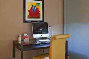
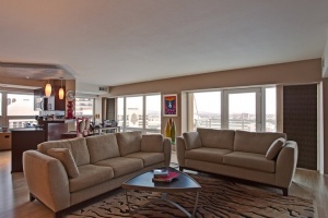
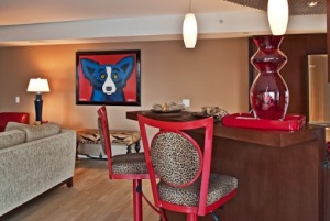
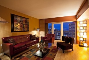
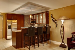
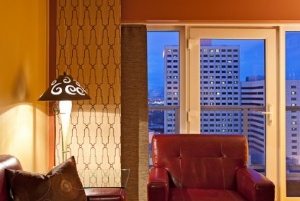
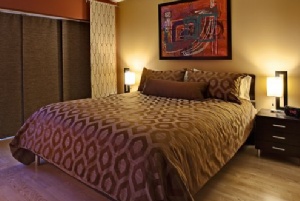
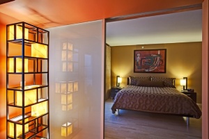
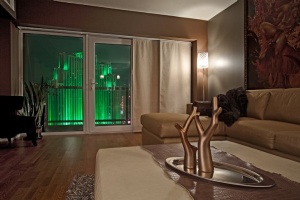
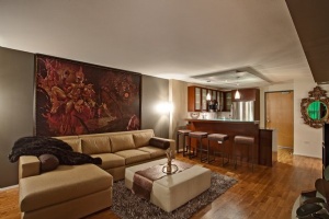
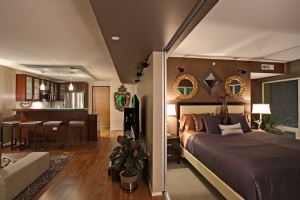
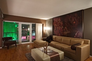
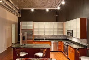
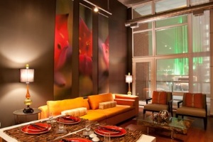
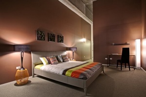
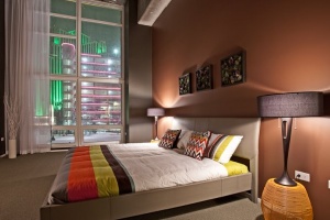
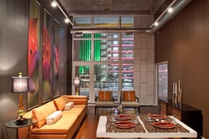
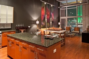
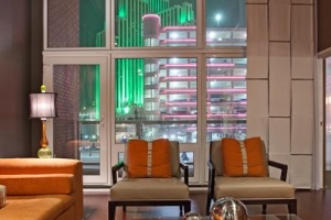
Aspen Leaf Interiors, helmed by Betty Scott and Marcio Decker, has transformed four Montage residences into modern masterpieces that complements the building seamlessly, building upon the architecturally sleek palette that L3 Development so painstakingly sought through to completion.

What's most impressive about Marcio and Betty's interior designs is that they vary wildly from unit to unit within the Montage, building the spaces out to fit the owners' personalities. I had a chance to walk through two of these residences recently, and the interiors are truly stunning, complementing both the Montage as a whole and the owners themselves. Even though the Craftsman and arts and crafts Bungalow movments of the early 1900's is more my style of interior decor, I was taken back by how beautifully the interiors matched both the building, and the owners simultaneously. Now that's a good designer.

I invite you to check out the work they have done in the Montage, and if you happen to be moving into the Montage, consider Aspen Leaf Interiors to finish out your space. They seem to have a synergy with the building judging by the work they do. My favorite Aspen Leaf Montage makeover is the loft space. I love the rough concrete ceiling texture and chocolate and gray motifs.

And stay tuned for an upcoming co-post which will have interviews of Montage residents, what they think of downtown Reno, and why they have no regrets purchasing at the Montage. Yes, there are people moving downtown, and yes, they are happy :)

The Montage Interior

Post your comments
  • September 19, 2010 - 11:22:47 AM

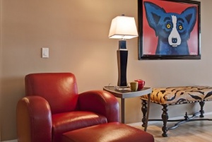
    In your first photograph, I love the red chair, carpet design and the blue dog on the wall. That is so me. Wow first-class designs all the way.

  • September 19, 2010 - 12:54:23 PM

    Slide 4. Red bar stools with leopard print fabric = heaven.

  • September 19, 2010 - 2:47:28 PM

    I love the Montage and Downtown, there's so much enthusiasm for the building and the people that live there love it and that's great but then I hope the people who step out on their balcony don't look at that shuttered Fitzgeralds all dark and what not and not cringe. I hope that something is done to that building in my lifetime lol. I'm happy for the residents at the Montage and one day I will soon be the proud owner of a unit there ;)

  • September 19, 2010 - 6:22:05 PM

    tacky, tacky, tacky...a good interior deisgner understands function and innovation, while the tile design work is admirable, the rest leaves me wanting more. Being able to purchase matchy furniture with cheap looking textiles does not a designer make. It's clear these two can shop, but I would hardly sing their praises as desing gurus...then again it is Reno, hardly known for it's high levels of taste and sophistication.

  • September 19, 2010 - 6:46:44 PM

    If you think that's tacky then your design experience obviously stops at Walmart. I love their work and I'm a NYC transplant. Go take some design classes Tasty

  • September 19, 2010 - 7:09:33 PM

    Hey let's all play nice :) design is a personal thing. Not all folks will like all designs. I have good taste, and I like the designs.

  • September 19, 2010 - 9:22:11 PM

    tasteandstyle, your blanket statement about Reno is pretty offensive. I am not sure what kind of homes you hang out in, but I have seen homes in Reno that make 'designer homes' in other cities look like amateur intern work. Do you even live in Reno?

  • September 19, 2010 - 9:42:27 PM

    The loft is my favorite. I live in SF, just started following this site recently because real estate is a bargain up there right now. I am familiar with good and bad design, I deal with it every day as a developer. I say this with all honesty, there are people in the bay area who wish they could execute modern urban design as well as the photos I see here.

  • September 19, 2010 - 10:19:14 PM

    I did not get the impression the author presented Aspen Design as design gurus, but that They constructed some cool looking spaces in a very unique project.

  • September 20, 2010 - 7:01:32 AM

    I think these are all incredible. Some aren't what I would choose exactly, but that's the whole point - these aren't models (except the loft) with unlimited budgets. These are client's homes - client's with specific tastes and aesthetics and budgets! I think each space is as unique and interesting as the clients themselves. I think their color palettes are gorgeous, the tile work amazing and the other art and decor (yes they can shop - that's part of the package!) is spot on. I think Aspen Leaf Interiors is incredibly talented and Reno - and The Montage - are lucky to have them!

  • September 20, 2010 - 7:02:03 AM

    These are spectacular. I want one! How much are the condos going for in the Montage?

  • September 20, 2010 - 8:01:54 AM

    While I generally like their work and applaud some of their color and furniture choices, I think most of the spaces appear to have been designed for a photo shoot and not for actual living. Everyone knows that space is at a premium in an urban condo. Where is the storage? So many of the pieces represent a missed opportunity in my mind. Not everything needs to appear light and open. There is beauty if functionality too.

  • September 20, 2010 - 9:14:01 AM

    Well of course these were staged for photographs, but Justin you have been in Scott and Vinnie's place right? Theirs is pictured above and it's VERY livable to me. Same with B's place (also pictured above). I highly doubt Betty would design her own space to not be livable and functional.

  • September 20, 2010 - 9:20:54 AM

    Yes, I have been in their place and it should be noted their unit actually has storage. The loft space, which I find visually appealing, has zero storage anywhere (e.g. night stands, coffee tables, end tables, dressers, etc.). Just a bit of constructive criticism. :-) Here's an example of a condo that is stylish and practical/livable: http://www.hgtv.com/urban-oasis/hgtv-urban-oasis-beautiful-room-pictures/pictures/index.html

  • September 20, 2010 - 9:28:45 AM

    Hmmm I will have to hit B up on that. My guess would be the owner didn't need/require any storage, perhaps because it's a second home, since a good designer always designs the space for the owner. I didn't even know one of the lofts had sold, much less was interior decorated. So that was the big shocker for me.

  • September 20, 2010 - 11:12:51 AM

    Everyone's a critic. Keep in mind, people with cash spending money are conservative and want things that are popular fashionable not cutting edge. I don't like the Rodrigue blue dog paintings but I really like what looks like Franz Szony's paintings. I'd also paint that loft ceiling. Bare naked cement ceiling is only cool if it doesn't look horrible and has plain consistency not little holes and irregular seams everywhere.

  • September 20, 2010 - 1:10:04 PM

    Thanks for the praises Mike! It certainly is a pleasure working in the Montage and my neighbors and clients are all so wonderful. So fun to customize each condo to suit our clients' different personalities, tastes, and lifestyles!

MENU